


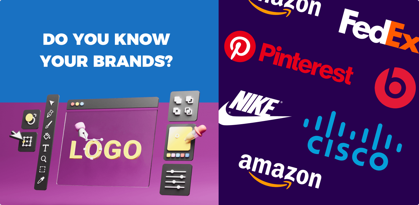
What makes a brand memorable and unique? A stand-out name for one, and a logo that is easy to remember and associate with that name. The truth is, brand creation and research takes years, and is a heavy process involving understanding what your brand’s mission and products or services stand for — what makes you unique, what makes you better than competitors, and what makes you so great. And when that is all crafted, you end up with a brand logo: your visual identity as a company. And we’re all familiar with so many company logos we see daily through TV, the internet, billboards, and more.
But did you know that some well-known company logos are not as simple as they seem? Yeah, in fact, some hold history and significant meaning, which in turn, help bolster a strong brand story. Let’s take a look at 12 big-name brands and their company logos.
Audi
![]()
Known for its sleek and powerful cars, Audi is also widely recognized by its prominent four-ring logo. What do these rings stand for? The Olympics? Not quite: Audi actually came from the formation of four separate automobile and engine manufacturers — Audi, DKW, Horch, and Wanderer. The four German auto names merged in June 1932 to form Auto Nation AG. It utilized four rings to symbolize the bond between the partners. In the 1960s, the Volkswagen Motor Group acquired the group, and went with the name Audi to create one brand. The four rings of Audi’s logo, however, still exist untouched today to symbolize the early beginnings of the luxury automaker.
Toyota
![]()
The Japanese carmaker may appear to have a super-plain company logo on the surface, but there is actually hidden symbolism in the T-shaped emblem that has been around since 1989. Unbeknownst to many, the two inner ovals represent the heart of the customer and that of the company. The overlap is meant to symbolize Toyota’s commitment to its customers. The T formed is also supposed to symbolize the T-shape of a car steering wheel.
The larger outer oval that houses the two T-forming ovals is meant to stand for the world embracing the brand. The thickness in the emblem’s ovals is also believed to be a nod to brush strokes in brush art, which is an integral part of Japanese culture. The blank space within the logo stands for the infinite values of Toyota such as joy of driving, innovation and integrity in safety, and more.
Amazon
![]()
Being the largest online retailer in the world, it’s no surprise Amazon is a universal name. And while its name speaks to the large, seemingly-endless number of products it sells (much like the synonymous river in South America), many may not know something hidden in its logo. The arrow in the Amazon logo is pointing from “A” to “z”. This adds a double meaning to the brand to speak to how it carries everything “from A to Z.” Also, it has been said that the arrow represents a smile to convey customer satisfaction.
Baskin-Robbins
![]()
Known for its creative flavors of ice cream and bright pink-and-blue color scheme visible from miles away, this national ice cream shop chain has quite a modern, edgy logo today. However, back in its earlier designs from its founding in 1947 up until 2006, the logo wasn’t always so sleek. Past company logos always featured a prominent “31” front and center, along with the last names of the founders, Burt Baskin and Irv Robbins. The 31 was a nod to the brand’s slogan of “31 flavors”: one flavor of ice cream for every day of a month. But that crucial 31 isn’t exactly gone from today’s iteration of the Baskin-Robbins logo. Just look closer: the pink parts of the “B” and “R” letters slyly form a 31. Thanks to ad agency Ogilvy and Mather for that magic!
Apple
![]()
It seems everyone has a product from the Cupertino, California-based tech giant. And while through the decades the brand’s logo has always been an apple, some may wonder if there is greater meaning to the brand’s famous symbol. And yes, there is. Supposedly, the apple is supposed to speak to the story of Adam & Eve and how Eve bit into the apple from the Tree of Knowledge. Given Apple is behind smartphones and computers and laptops and tech services that bring people together and spread information, it’s quite fitting (and clever), don’t you think?

Nike
![]()
Just do it, right? The sportswear giant’s name is known to be associated with Nike, the Greek goddess of victory — but do you know what the check mark stands for? The swoosh is actually representative of the goddess’ wings. The check mark was adapted under the Nike name to stand for the sound of speed, movement, power, and motivation. Think of it like empowering every athlete and everyday person who wears the brand’s clothing. Pretty inspiring, huh?
Beats
![]()
The beloved headphones brand, known in full as Beats by Dre, may sport a logo that features a simple “b” to some, but in fact, the “b” is meant to represent the brand’s signature headphones — and the circle around the single letter is supposed to represent a user’s head. This imagery allows users to see themselves wearing the headphones, tying in a deeper customer-brand connection.
FedEx
![]()
Ah yes, your neighborhood delivery service that is always going in and out of the neighborhood roads to deliver people their packages. While the FedEx logo may look simple and straightforward, take a closer look between the “E” and “x.” There is in fact, an arrow hidden in the blank space to signify the precision, speed, and forward-movement of the company’s delivery service.
Toblerone
![]()
Ah, the Switzerland-made chocolate is famous for its triangular mounds of nougat, almonds, honey, and milk chocolate. And just like the rock-hard nature of its bars, the mystery behind its mountain logo is just as difficult to see (at least at first glance). Within the white detailing of the mountain to the left, you’ll have to look closely to see what appears to be the outline of a bear. Coincidence in design? Actually no — the bear was added in as homage to Bern, the Swiss capital where the bar was created. Bern is known as “The City of Bears,” so it only made sense to founders Emil Baumann & Theodor Tobler to include it subtly in the brand’s logo. The mountain featured is also believed to be the Matterhorn mountain of the Swiss Alps, which is also the triangular inspiration for the candy’s bar shape. The more you know, right?
Cisco
![]()
The tech conglomerate known for its networking and security software has a bar design for its logo which may be unassuming to most passerby. However, there is more than meets the eye! The bars are supposed to represent the Golden Gate Bridge, a nod to the company’s headquarters in San Francisco. It is said the bridge also stands as a symbol for how it connects the city of San Francisco. This, in turn, metaphorically represents the tech services of Cisco and how it connects the world.
LG
![]()
Life’s good, right? Especially when a company aimed at improving human life is behind it all. Unbeknownst to many, the LG logo is more than two letters — the circular element to the brand logo is a face, with the “L” acting as a nose, a dot acting as an eye, and the outer “G” acting as a face shape. The smile the logo gives is a nod to LG’s strive for technology that betters day-to-day life for its customers.
![]()
The go-to platform for interior designers and crafty stay-at-home moms, Pinterest is known for its ability to let you “pin” (essentially, save to boards, which are save folders you create) images that inspire you and fit your mood or vision board. While Pinterest’s logo just appears to be a stylized “P” in a red circle, many do not know that the “P” is designed to represent a pushpin. That’s how it’s bringing to life the real “pin it” feature that the platform is unique for.
SUMMARY: It’s clear that even the simplest company logos tend to hold a double meaning, which enrichens the brand story. Whether you are building a brand of your own and in the midst of designing a logo, or a shopaholic who knows all your company logos by heart, the big takeaway here is that a brand logo isn’t just a draw-it-and-slap-it-on kind of thing. It’s something that involves storytelling and belief to leave a customer in awe. Get creative in your logo-designing process, and remember to tie in something deep and meaningful into it!