Are you looking for ways to boost your online store revenues? Say no more! It’s the properly made product pages that matter!
To improve your online store performance, first of all, you need to find out: do visitors leave your store without making a purchase? At what stage is it usually happening and why?
As a rule, some of the most common reasons for going away empty-handed is a poorly designed product page, low-quality product pictures, or a meaningless product description.
So how to deal with them? How to provide your customers with perfect product pages that SELL and convert like crazy?
Glenn, our today’s guest, knows the answer to this question! Recently, he started an online store that’s now growing steadily and giving him a great extra source of income.
But, things weren’t always bright for Glenn! At the beginning of his ecommerce career, he struggled to make ends meet.
What did he do to turn things around?
Let’s talk about winning product pages and the role they have in your – and Glenn’s – ecommerce success!
High-converting product pages as an easy way to boost store revenues
Some entrepreneurs believe that it’s absolutely not necessary to pay attention to product pages.
Of course, creating detailed product descriptions from scratch is a time-consuming process. Especially, in case we’re speaking about high-converting texts and visuals that make visitors buy ASAP.
This is a lot easier just to copy the descriptions that your supplier provides, right? However, when you deal with suppliers who have a different first language than your clients, you’ll have to edit their descriptions – and here’s why:
- If the descriptions are written in the target language, but have mistakes and sound unnatural, they don’t inspire much trust in your store. Of course, such lack of credibility can negatively impact your store performance.
- If the supplier doesn’t provide detailed product descriptions, it’s difficult for customers to make a well-informed purchase decision. Unable to find clear info (size, material, care instructions, etc.), they just leave!
- To sell well, your product pages need to have a clear structure that stays the same from product to product. This is how you can deliver a compelling marketing message with an inspiring call to action.
But how to create the perfect product page that will convert like crazy? Here’s Glenn who knows this for sure. He is running his own ecommerce store, and he has kindly shared his strategy to create the best ecommerce product pages.
How to get the best ecommerce product pages
A profitable product page needs to have several important elements. Here they come!
Title
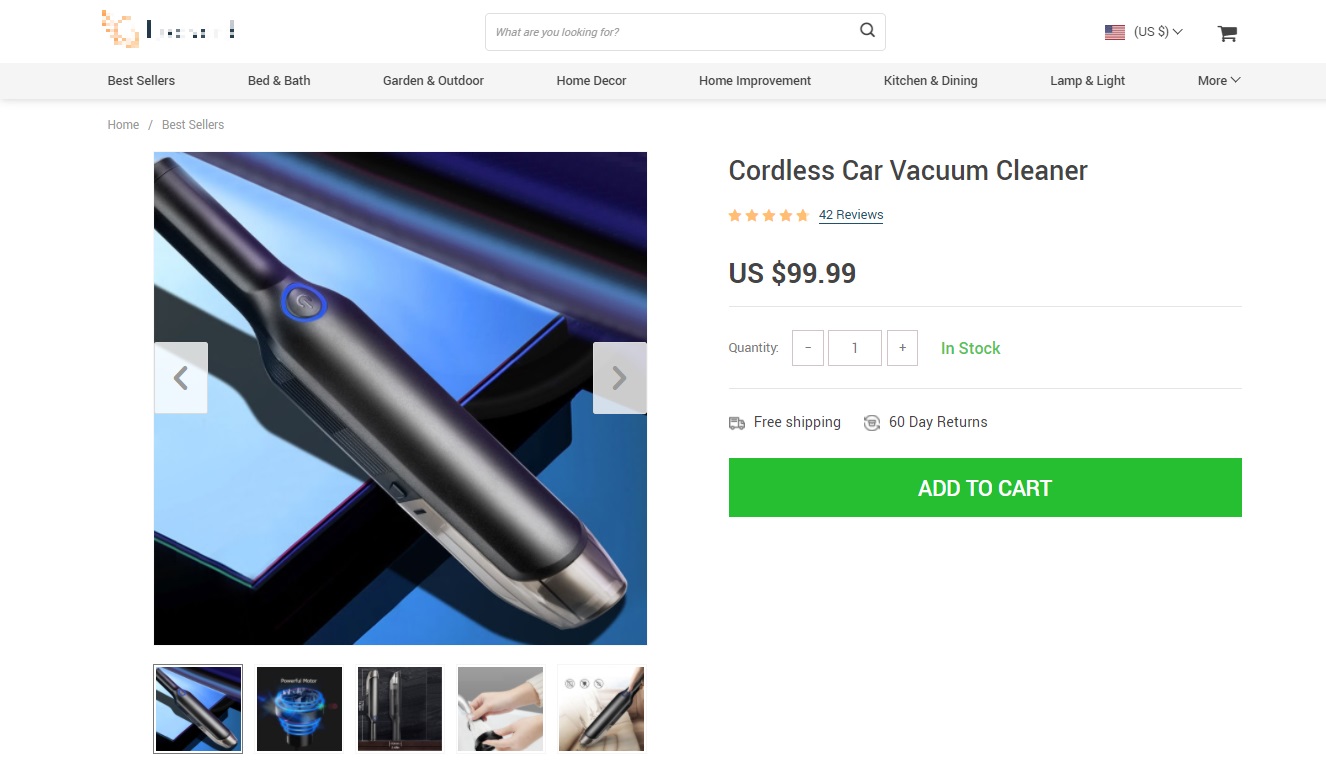
The first product element you’ll have to edit (or create from scratch) is the product title. If you partner with foreign suppliers, you’ll soon notice that the product titles they use tend to look odd. Usually, this is a mix of words that have little to do with each other and don’t make a clear, catchy, purchase-stimulating phrase.
The main idea here is to make a product title short enough, but insightful and eye-catching. Make sure each title in your store explains what this product is and does, and meantime, looks perfect.
Product description
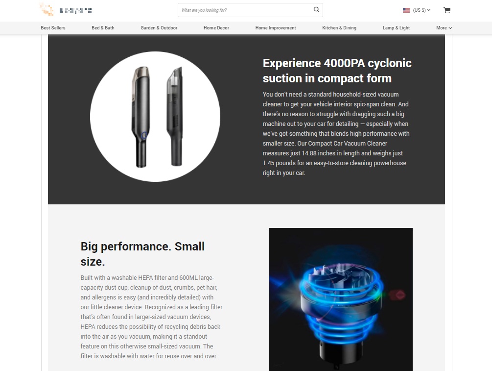
Product descriptions are probably the most important part of an ecommerce product page. This is the element that provides a potential customer with enough information about the product.
And this is exactly the page part that online entrepreneurs use to make a customer finally place an order! This is why it should be done neatly and follow several essential rules.
Here’s an easy way to create product descriptions that sell like crazy:
- Make them clear
The easiest and most reliable way to convince your potential customer to make a purchase is to explain that a product is able to solve their real daily problems. Give them the solution they dream of and they won’t definitely get past!
- Provide enough details
Each product should have an informative description. Give your potential customers the insights into each product you offer. Ideally, there shouldn’t be any questions left for a visitor after reading the description – and no doubt whether this is exactly what they’re looking for.
- Use CTA
By this point, you’ve already described the issue your product is designed to solve and provided its detailed specification. So all you have to do is push them to make a purchase.
Image gallery
The first thing your potential customer sees when visiting any product page is the product photo gallery. That’s why a perfect product image is the part of the product pages that draws customers’ attention and makes them want to take a closer look at the product.
What should the perfect product images have?
- High resolution
Poor quality pictures repel customers, that’s for sure. Show your customers that you pay particular attention to details and can proudly present all the product’s ins and outs!
- Consistent style
How to enhance the credibility of your store? Make sure the product pictures have the same style and layout. In this case, your website visitors will be sure that all the pictures are uniquely taken for your store, and your website is not a scam.
- Informative close-ups from different angles
Let your store visitors explore the product from all sides. If they get complete information about the product, they will be more likely to make a purchase and not to be disappointed after receiving it.
Online shoppers value visuals greatly: for them, it’s the only way to examine the product before purchase! So, try to catch their attention by pictures, make them read product descriptions, and then, your CTA will easily do its job!
Feedback
User-generated content is a must for a high-converting product page as it can help you enhance the credibility of your store. That’s why you have to pay attention to the feedback unit and take care of the following:
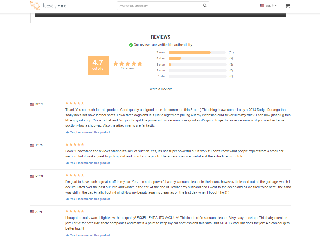
- Each product has lots of reviews
- Most (but not all) of them are 5-star reviews
- There are authentic users’ pictures in the reviews
- Reviews are more than one sentence long
But few suppliers provide feedback for the product they offer, and so what should an online entrepreneur do in such a case? Actually, there’s a way out. And it will help you not only with feedback!
How to create high-converting product pages in a couple of clicks
The point is that creating a high-converting product page from scratch is not a challenging, but time-consuming process. But what if there are dozens of products in your online store? Or you don’t have time to test new product pages, but you want to start earning from day one? In this case, Sellvia will come to your aid!
When Glenn started his ecommerce business, he didn’t actually know what to pay his attention to. This was the reason why his online store wasn’t quite successful at the outset.
After a while, Glenn decided to appeal to the statistics and find out what exactly is wrong.
Statistics showed that Glenn’s advertising activities were good enough: Facebook ads were providing the store with traffic. The number of potential customers was not large, and most of them left the store after seeing a product page. So, Glenn decided to pay closer attention to the products on offer and the quality of their individual pages.
This is how Glenn started working with Sellvia as the ecommerce ecosystem solving his multiple ecommerce issues at once.
Sellvia provides each product from its catalog with a ready-to-go, high-converting product page that takes a couple of clicks to be imported into your online store.
Here’s what made Glenn interested in the product pages he could get from Sellvia!
-
Product title & description

Each product description here consists of several units that give customers complete understanding of what a product is, what it is for, and what the specifications are. Beyond this, at the end of each product description there’s a CTA aimed at converting as many customers as possible.
-
Image gallery
There are plenty of images in the gallery showing the product from all the angles possible. Plus, they even explain how to use the product if it’s a complex one! And, as all the photos are taken in the same style, they give the store a professional look and boost its credibility a lot.
-
Customer feedback
All the products have a lively feedback section. There are dozens of reviews of each product! All of them consist of at least several sentences and high-quality photos taken by the end users. That’s all you need to inspire more trust in your store!
How Glenn boosted his online store performance with the Sellvia product pages
As soon as Glenn started working with Sellvia and using their ready-to-go product pages, the business revenues went up.
Customers stopped leaving the store after visiting product pages.
The conversion rate increased considerably.
And the overall store performance now lets Glenn have a steady source of extra income!
So, are you looking for a way to boost your online store revenues significantly, too? In this case, this is a high time to team up with Sellvia! What you get from this partnership is more than high-converting product pages only:
- Trending products from different niches at low prices
- Fast US shipping
- Ready-to-go marketing materials for huge profits
Plenty of ecommerce entrepreneurs have been already partnering with Sellvia and benefiting from that. So, wouldn’t you like to start your own profitable venture with Sellvia? Or, maybe, boost the store you’re already running? You’re welcome to start a new chapter of your ecommerce success story!


