An ecommerce website is a powerful tool for businesses looking to expand their reach and increase sales. For online store owners, it’s crucial to work on website conversion optimization: it can boost sales, revenue, and customer loyalty.
A high-converting ecommerce website is one turning visitors into customers through a combination of design, user experience, and marketing strategies. Here, the goal is to make it easy for visitors to find what they’re looking for, understand the value of the products you offer, and make a purchase.
In this article, we will discuss the essential elements of a high-converting ecommerce website and provide examples of best practices and effective design. We’ll also take a moment to show how Sellvia can help businesses create and manage an ecommerce store that incorporates these elements, so stay tuned!
Website conversion optimization 101: 10 must-haves of a high-converting website
Here are the essential elements that a high-selling ecommerce website should have in order to maximize conversions:
#1 Navigation menu

A clear and easy-to-use navigation menu is essential for a high-converting ecommerce website. Visitors should be able to find what they’re looking for quickly and easily. The navigation menu should be located in a prominent place on the website, such as the top of the page, and should be organized in a logical and intuitive way. Additionally, the navigation menu should be responsive and adapt to different screen sizes.
Best practices for navigation menu design include using simple and clear language, providing drop-down menus for subcategories, and including a search bar.
#2 Product images and descriptions
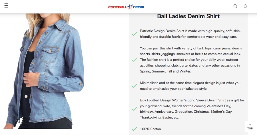
High-quality product images and detailed descriptions are a must for website conversion optimization. Visitors need to be able to see what they’re buying and understand the value of the products you offer. Product images should be high-resolution and should show the product from multiple angles. Detailed product descriptions should include information such as size, color, and material, as well as any additional features or benefits.
Best practices for product images and descriptions include providing zoom functionality, using alt tags for images, and including customer reviews and ratings.
#3 Shopping cart
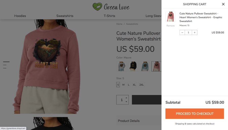
A user-friendly shopping cart is crucial for website conversion optimization. The shopping cart should be easy to use and should clearly display the items in the cart, the total cost, and the shipping options. Additionally, the shopping cart should be located in a prominent place on the website, such as the top of the page, and should be accessible from any page on the website.
Best practices for shopping cart design include providing a “view cart” button, displaying the number of items in the cart, and providing a “proceed to checkout” button.
#4 Payment gateway
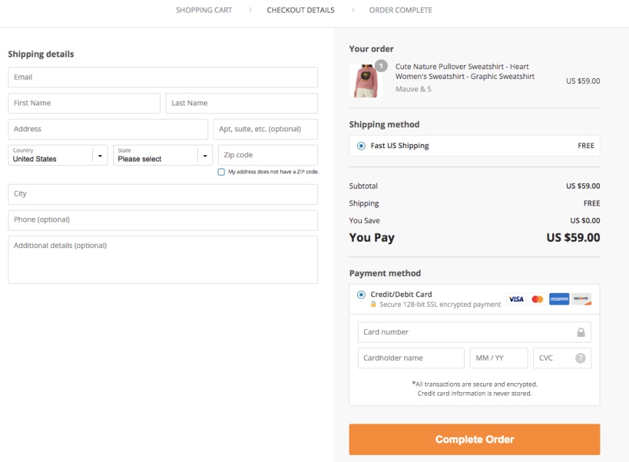
A secure payment gateway is a top priority for a high-converting ecommerce website. Visitors need to feel confident that their personal and financial information is safe and secure when making a purchase. The payment gateway should use industry-standard encryption methods to protect sensitive information. Additionally, the payment gateway should be easy to use and should provide multiple payment options, such as credit card, PayPal, and Apple Pay.
Best practices for payment gateway integration include providing a secure and encrypted connection, displaying trust badges, and offering multiple payment options.
#5 Return and refund policy page
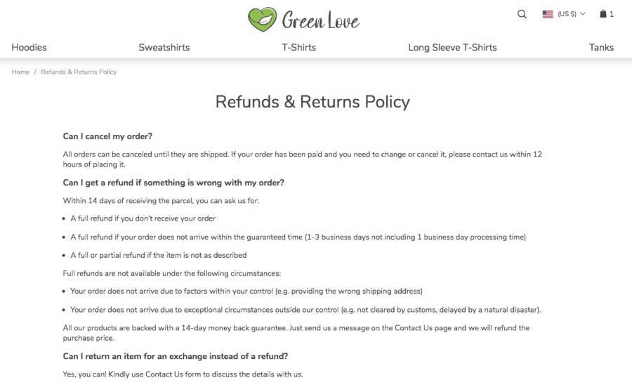
A clear and easy-to-understand return and refund policy is another key to website conversion optimization. Visitors need to know what to expect if they are not satisfied with their purchase and should be able to find information on returns and refunds easily. The policy should be written in simple and clear language, and should be accessible from the website’s footer or by a link on the checkout page. Additionally, the policy should clearly state the conditions under which returns and refunds will be accepted, as well as the process and timeline for returns and refunds.
Best practices for return and refund policy include providing a dedicated page for the policy, including a contact email or phone number for customer support, and being transparent about the process and timeline for returns and refunds.
#6 Mobile optimization

Mobile optimization is absolutely necessary to make your store a high-converting one. With more and more people using their smartphones and tablets to browse the internet, online purchases become frequent. This means that your store should effortlessly adapt to different screen sizes. Plus, all the elements of the website, including the navigation menu, product images and descriptions, shopping cart, and payment gateway, should be easy to use on a mobile device.
Best practices for mobile optimization include using a responsive design, providing a mobile-specific navigation menu, and optimizing images and content for mobile devices.
#7 Call-to-actions

Call-to-actions (CTAs) are an essential element of a high-converting ecommerce website. The website should make it clear what the next step is for visitors, whether it’s making a purchase, signing up for a newsletter, or contacting customer service. CTAs should be prominently displayed on the website in a form of buttons or links that encourage visitors to take a specific action, and should be clear and compelling. The text on the CTA should explain what the visitor will get by clicking on the button.
Best practices for CTAs include using action-oriented text, making them prominent and easily visible, and testing different versions of the CTA to see which one performs best.
#8 Customer reviews and ratings

Customer reviews and ratings play a huge role in website conversion optimization. These provide visitors with valuable information about the products or services being offered, thus creating the essential social proof. What’s more, these can help to build trust and credibility, prompting site visitors to make their purchasing decisions faster. Reviews and ratings should be prominently displayed on the website, and should be easy for visitors to find and read.
Best practices for customer reviews and ratings include making it easy for customers to leave reviews and ratings, and responding to both positive and negative feedback in a timely and professional manner.
#9 Search bar
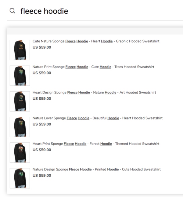
The search bar is instrumental for website conversion optimization because it improves the user experience by making it easy for visitors to find what they are looking for. This can lead to increased engagement and conversions, as visitors are more likely to find and purchase products they want.
In addition to improving the user experience, a search bar can also help with search engine optimization (SEO). Search engines such as Google use the keywords and phrases entered into the search bar to understand the content of the website and improve its ranking in search results.
A well-designed search bar should be easy to spot and use, with clear instructions on how to use it. It should also provide relevant and accurate results, and allow the user to easily filter their search results by various criteria such as price, brand, and category.
#10 Social media widgets and buttons

Social media buttons are an important element of a high-converting ecommerce website as they allow businesses to connect with customers and promote their products through social media platforms.
By adding social media buttons to their website, businesses can encourage customers to follow them on social media, share their products with their friends and followers, and engage with the business on social media. This can increase brand exposure, drive traffic to the website, and ultimately, lead to increased conversions.
When it comes to adding social media buttons to an ecommerce website, it’s important to choose the right platforms. The most popular social media platforms for businesses include Facebook, Twitter, Instagram, and Pinterest. It’s also important to ensure that the buttons are easily accessible and prominently displayed, with a consistent and recognizable design.
By including these essential elements in your ecommerce website, you can increase conversions and turn more visitors into customers.
It’s also worth noting that regular testing and optimization is important to maintain a high-converting website. This includes A/B testing, heat-map analysis, and user testing to identify areas of improvement.
How do you get a high-converting ecommerce website with Sellvia?
Interested in website conversion optimization? Take a look at Sellvia stores: they meet all these criteria – and more!
Using Sellvia, even the smallest businesses that are just starting out get an opportunity to get their own ecommerce stores. Sellvia stores have all of the essential elements of a high-converting ecommerce website in place! These include a responsive and user-friendly design, easy navigation, clear product descriptions, high-quality images, secure checkout, and convenient shopping cart.
View the fantastic Sellvia demo stores here!
The stores have a clean and modern design, with easy navigation allowing visitors to quickly find the products they want. The product descriptions are clear and detailed, and the images are high-quality and showcase the products in an attractive way. The checkout process is secure and easy to use, with reliable payment gateways available.
These elements, when combined with Sellvia’s beginner-friendly interface and powerful features, make it easy for newcomers to create and manage an ecommerce store that drives conversions and grows their business. Curious to experience it yourself? Get your amazing Sellvia store today and explore all the thrilling opportunities that ecommerce opens up!


