Finding a good dropshipping product isn’t enough to get lots of sales. Providing a stellar online shopping experience for your potential customer should be your main priority. A great product page will help raise the conversion rate of your online store and satisfy your customers’ needs. By using Sellvia, you get access to professionally made product pages consisting of high-converting elements.
We all know that without good products or services, a business cannot thrive. But today, having hype goods in your inventory isn’t enough. You also need to spark your customers’ interest, and if you have an ecommerce store, it’s a well-made product page that does the job.
Let’s talk about them today and see how they can boost your business!
What’s so important about a product page design?
Let’s suppose you need a new jacket. You go to a clothing store and look at their offers. And then you… take different jackets, touch them to check the quality of the fabric, try them on to see if they’ll fit, and so on.
But what if you decide to buy a jacket from an ecommerce store?
Instead of touching, you can only look at product images or videos. Instead of trying on, you only have a size chart. And the product details section is the only thing that’ll tell you about the fabric used.
What is a product page?
A product page is a website page that showcases the product or service that you’re selling.
It generally has a few distinct features that separate it from any other webpage. One definite feature is a description of the goods and their features. The primary goal of a product page is to facilitate the buying process by showing the product’s benefits and how they help solve customers’ problems.
What sections should be included on your product page?
Of course – the most important product details, however, what should be included there? Here are the standard components of a product page design and how to get the most out of each one.
Product details
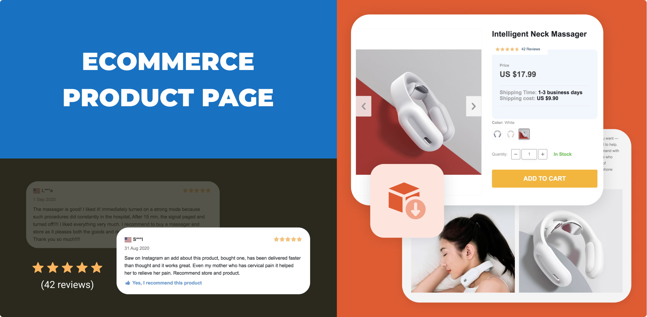
The best product details sections consist of the product image, any relevant product information, and an add-to-cart button.
-
The image on the left, text on the right
Nearly every ecommerce website follows this rule, and why should you change what’s already perfectly working? Even Amazon includes this type of information layout – the image is on the left, but the text is on the right.
Success on Amazon depends on many factors, one of which is the design of the product pages, as they create the most effective customer experience. There are two main criteria for the product page to resonate with customers: the trustworthiness of your brand and the degree to which customers can evaluate the product by reading about it rather than experiencing it.
-
The F-shaped pattern
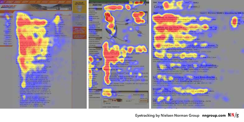
According to research back in 2006, people scan websites in an F-shaped pattern.
Like this:
This means the top of the image – all the way across – is the most visually salient. From this image, you can trace an F shape on each image example. This means that up and to the left is your money spot: that’s where our eyeballs at first land.
Since location matters, you want to place important elements where you’re confident shoppers will see them.
-
Product details conform to the shape of the image
The product page is designed to overflow and go beyond the height of the image. This keeps the page tidy and establishes a clear separation between sections.
Product details are only the most immediately relevant details. Here’s an example of how it should look like.
Name: The full name of the product.
Description: A brief description of the product.
Customization: If there are customization options, put them here.
CTA: The “Add to Cart”/ “Buy Now” button.
Social Proof: Social proof next to the CTA helps establish trust between the brand and the shopper.
-
Additional optional details
Some companies attempt to keep the product page design to a minimum, so they place additional details and specifications in accordions and tabs.
This keeps the product details section from being too overwhelming. It also keeps the focus on the CTA button.
-
Related products
You always want shoppers to click on and view other items in your store. In marketing, this term is called “cross-selling”.
That’s what your related products section is for.
A complement-centered design is an excellent way to optimize your product page. This makes it easier for shoppers to select items that pair well with the page’s primary offering.
This improves the shopping experience, but it also increases average order value. Bigger conversions mean higher profit.
-
Social proof and user-generated content
Social Proof is one of the most powerful tools at your disposal. Why? Because of a key principle of successful digital marketing strategies:
People like us do things like us. When your ideal customer sees other people like them enjoying your product, what more do you need?
Thus, in other words, online shopping is very different from the real-life shopping experience. Even if your product’s really good, without a high-quality product page, you won’t be able to sell it. First, you’ll have to catch site visitors’ attention; then prove that your products are really good; and finally, prove that you’re not lying.
So, does it mean you have to learn how to make good product pages? Not at all! Because we’ve already made them for you!
You can import Sellvia’s product pages to your dropshipping store
If you have ever tried dropshipping goods from AliExpress, you must be aware of all the problems with product pages. Titles, descriptions, page layout, product details – you have to edit everything manually. And that will take about an hour per one product.
One of Sellvia’s advantages is that you can import professionally made product pages along with any item from Sellvia’s catalog.
So, what makes Sellvia’s product page elements so good?
Product Titles
You may think that it’s not really important how you name a product. But a proper title can lead a person to your website and eventually to the checkout page.
First of all, the wrong title can confuse customers. If site visitors get interested and click on your product to see more details, your job is not to disappoint them. But if the product is different from what they expected, there’s a high chance they’ll leave.
Second, a good title is short and clear. It explains what a product is and what it does in a short, simple phrase.
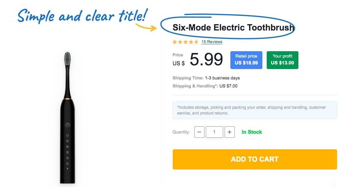
And finally, the titles used on Sellvia’s product pages are inspired by search queries people use to find such goods. That means, they reflect the product features that customers consider to be valuable and are specifically looking for.
Product images
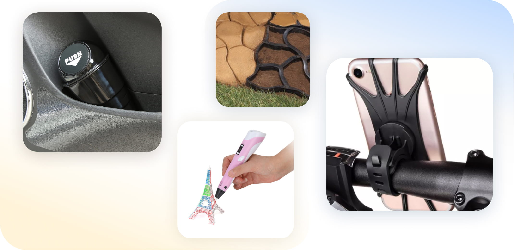
Today an ecommerce product page cannot be regarded as good unless it has high-quality images. As I mentioned before, It’s your only way to showcase a product. That’s why images must demonstrate items from different angles.
All photos of Sellvia’s products are taken by a professional photographer in a studio. So, you should not worry about their quality! Taken with proper lighting and from the same angle, these product pictures give the impression of a stylish and responsible shopping destination.
Moreover, good images show the product ‘in action’ so to speak. By looking at Sellvia’s product images, customers will easily understand how these products work and what makes them so useful.
Such photos are incredibly important for advertising purposes because a single glance is enough to get potential buyers interested.
Product descriptions
Another advantage of dropshipping products from Sellvia is our product descriptions. They are written by a professional copywriter and native English speaker. So, if you want to dropship to the US from abroad, you don’t have to worry about it.
In addition, Sellvia’s descriptions don’t simply provide accurate product descriptions — they highlight the benefits of user experience. This is the most efficient marketing approach. The information on our product pages explains how a product can solve a problem and answers all potential questions so that customers could go straight to the checkout without feeling any doubts.
And you can get these powerful descriptions along with any products you import from our catalog by subscribing to Sellvia.
Customer reviews
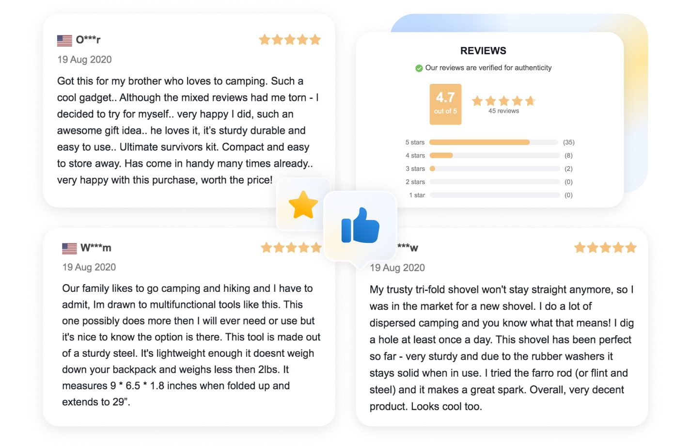
It’s important to build trust between you and your customers. But today, people view ads with skepticism. The only opinion they trust is the one coming from another customer.
That’s why product reviews left by previous clients are crucial for any product page. Some buyers don’t even read descriptions but move to the reviews section right away to check what real people say. At this point, they want to hear three things:
- that the product actually does what you claim;
- that the item’s quality is high enough;
- and that the product will be safely delivered in time.
By importing the reviews from our product pages, you will be able to earn your clients’ trust.
Moreover, a large number of these reviews also contain customer-made photos of the product. It’s another important social proof. Seeing a picture taken by a regular buyer like yourself is the best ad you can ever have.
Positive customer reviews motivate your site visitors to click on the BUY NOW button. You can also use them for advertising on social media.
Sellvia makes it easier to attract clients
As you can see, Sellvia isn’t just a catalog of dropshipping products that can beat even large retailers in terms of price and shipping speed.
Sellvia is also your source of product materials and, most importantly, images, descriptions, and customer reviews. With these elements, you can create truly attractive product pages that will convert visitors into customers much more efficiently.
A good product page is a game-changer for an ecommerce business! To benefit from this and other features, subscribe to Sellvia, install it on your dropshipping store, import the products you like, and start making money!


