If you’re running an online store, you already know how much effort (and money) goes into bringing traffic to your site. But what happens when all those visitors browse your products and leave without buying?
Here’s where investing in conversion optimization for ecommerce website strategies pays off. It’s not about chasing more clicks – it’s about helping more of the people who already visit your store to actually buy something.
Whether you’re a business owner, growth lead, or digital marketing consultant, this playbook gives you both the “why” and the “how” of building a truly optimized ecommerce website.
Why conversion optimization matters more than ever
Imagine this: your store gets 10,000 visitors a month. If 2% of them buy, that’s 200 sales. Now, if you improve your conversion rate to 3%, you get 300 sales – without spending a single extra dollar on ads. That’s a 50% increase in revenue purely from making your site easier, faster, and more convincing for buyers.
Conversion is your growth lever
Traffic is expensive, competition is fierce, and customer expectations are rising every quarter. Conversion optimization isn’t optional anymore – it’s your lever for long-term growth. The brands that win today aren’t the ones shouting the loudest; they’re the ones making it effortless to shop, trust, and pay.
A well-optimized ecommerce site does more than convert visits into purchases. It also lifts average order value (AOV) by smart cross-selling, reduces cart abandonment, and improves customer lifetime value (LTV) because buyers are more likely to return. Every tweak – faster load time, clearer copy, cleaner checkout – compounds these effects.
How minor improvements multiply revenue
You’ll often hear that an average ecommerce store converts around 2-5% of visitors. That sounds small, but even minor percentage improvements have a huge financial impact. For example, if your store makes $50,000 a month at a 2% conversion rate, raising it by just one point adds another $25,000 in monthly revenue. That’s why CRO (conversion rate optimization) is called a “growth multiplier” in ecommerce.
Another hidden benefit is insight. By learning what makes people buy or hesitate, you sharpen every part of your marketing – from ad creative to email nurture flows. Instead of relying on guesses or copying competitors, you base decisions on how your real customers behave.
And unlike trends that fade (say, the latest ad format), conversion optimization keeps giving back. Once you fix your product pages or simplify your checkout, that improvement works 24/7 for months, even years.
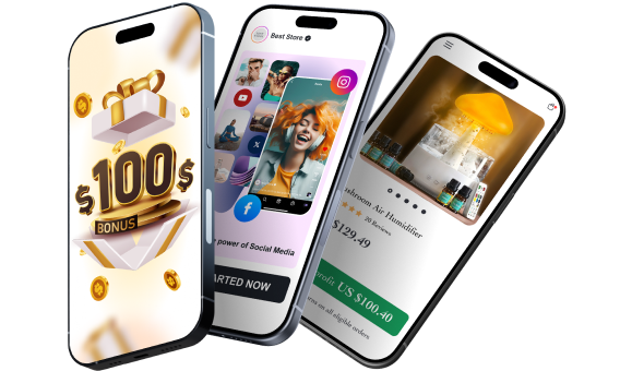
Designed for Sellvia stores, the Sellebrity theme sets the stage for effortless shopping and seamless sales. Optimized layouts, high-converting product pages, and streamlined checkout flows make sure every visitor has a frictionless experience.
Trust badges, review highlights, and urgency triggers encourage action without shouting, while mobile-first responsiveness ensures no customer is left behind. Simply put: it does the heavy lifting so you can focus on growth.
In short, investing in CRO is like compounding interest – it builds on itself. Now that we’ve seen why it matters, let’s figure out where your current funnel stands and how to measure what’s actually happening on your site.
Measure before you move: Finding your baseline
Before you start testing buttons or rewriting headlines, you need to know exactly how your store is performing right now. Think of this as taking a snapshot of your current funnel. Without that baseline, you won’t be able to tell whether your “improvements” are actually working or just cosmetic.
Your conversion funnel is the customer’s step-by-step path – from landing on your site to completing a purchase. A typical ecommerce funnel looks like this:
Visitor → Product view → Add to cart → Checkout start → Purchase.
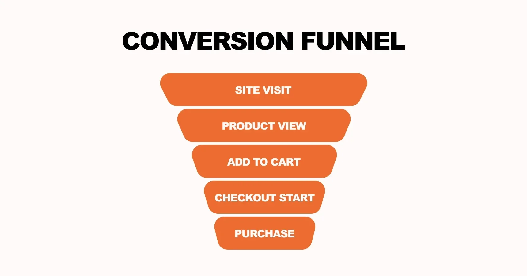
To calculate your conversion rate, divide the number of purchases by the total number of visitors, then multiply by 100. For example, if 1000 people visit and 30 buy, your conversion rate is 3%. Simple math, but powerful insight. This metric shows how efficient your website is at turning traffic into buyers, and it’s the foundation of any conversion optimization for ecommerce website strategy.
Now, don’t stop at the overall number. Break it down:
- By device (desktop vs mobile) – mobile usually has lower rates, but higher potential;
- By channel (paid, organic, email, social) – some traffic sources convert better than others;
- By product category – identify which products or price ranges underperform;
- By user type (new vs returning) – loyal customers usually convert higher.
Once you segment your data, patterns start to appear. Maybe mobile checkout drops sharply, or maybe paid social visitors bounce fast. Those clues point you to your highest-impact problems.
Tools like Google Analytics 4, Hotjar, or Clarity can visualise this journey. Combine numbers with qualitative data – heat-maps, session recordings, or short on-site surveys – to understand why users leave.
Setting this baseline gives you two big advantages: clarity and focus. You stop guessing, start prioritising, and can later measure every win in hard numbers.
Sellvia gives you clean, reliable data. Because pages load quickly and remain free from unnecessary code bloat, your metrics reflect reality, not artifacts of a sluggish or cluttered site. This means when you see drop-offs or friction points, you can trust that the numbers aren’t lying.

Next, let’s move from numbers to action – how to find the friction points and untapped opportunities that will deliver the biggest gains.
Spot the friction: Where your funnel leaks and opportunities hide
Once you’ve measured your baseline, it’s time to play detective. Somewhere between the homepage and the checkout button, people are slipping away – and your job is to figure out why.
The truth is, most ecommerce sites lose money not because of a lack of traffic, but because of friction. Friction is anything that slows users down, confuses them, or makes them hesitate before buying. Think of it as small roadblocks scattered across your site. The fewer of them you have, the smoother the path to purchase.
A good way to start prioritising where to look is the PIE model – Potential, Importance, and Ease.
- Potential: How much improvement can this area bring?
- Importance: How often do users visit or interact with it?
- Ease: How simple would it be to change or test it?
Focus first on areas with high potential and high importance – like your product pages, checkout flow, and mobile experience.
Common friction zones often include:
- Slow load speed (especially on mobile). Even a one-second delay can drop conversion rates significantly;
- Cluttered navigation that makes it hard to find what people came for;
- Weak product discovery – poor filters, search results, or category layouts;
- Lack of trust – no reviews, unclear return policy, or hidden costs;
- Complicated checkout – too many steps, forced account creation, or limited payment methods.
To spot these issues, combine data with real-world observation. Analytics can show you where people leave, but heat-maps and recordings reveal why. You might see shoppers scrolling nervously, tapping the back button, or getting stuck on a field that doesn’t load right.
Also, listen to your customers. Add a quick exit-intent survey asking, “What stopped you from completing your purchase?” The answers are often surprisingly clear: shipping costs, delivery times, or simply not finding the right size.
Once you’ve listed out friction points, flip the perspective – where are the opportunities? Maybe your “related products” section gets a ton of clicks but leads nowhere. Or perhaps visitors spend time on a certain category page but rarely add items to cart. Each of these moments hides growth potential.
By blending quantitative data (numbers) and qualitative feedback (behaviour and voice of customer), you’ll end up with a short list of high-impact zones ready for optimization.
Sellvia makes spotting and addressing friction easier. With built-in product galleries, fast page loads, and mobile-first navigation, you can see precisely where visitors hesitate, while integrated engagement triggers highlight opportunities for cross-sells or promotions without disrupting the flow.
Next, we’ll dive into the most valuable one: the product and category pages – where buying decisions are actually made.
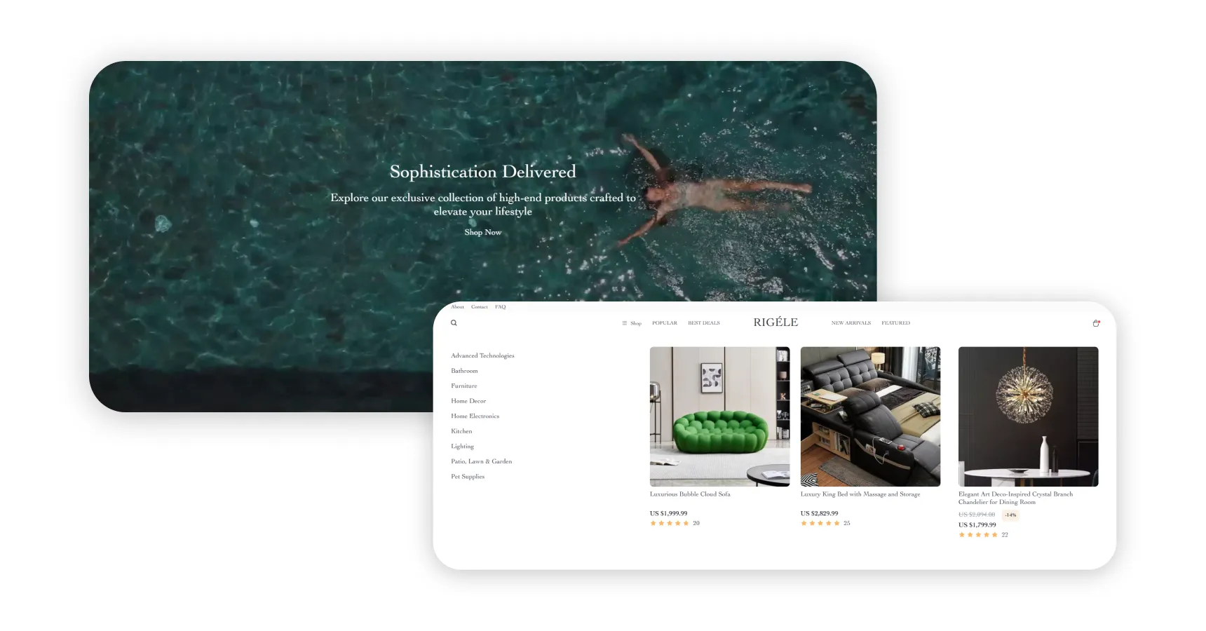
Product & category page optimization: The heart of conversion
Your product and category pages are where the magic happens – or where sales slip through your fingers. This is the spot where visitors decide whether to buy or bounce. Refining these pages is essential for improving conversion optimization for ecommerce website growth.
Before diving into specific tweaks, it’s worth taking a closer look at what really drives conversions – because understanding the why makes the how much easier.
What really drives conversions
Conversions don’t happen by chance. Every element on your pages nudges visitors toward – or away from – action. Here’s the full picture:
1️⃣ Design & visual appeal
First impressions stick. Clean layouts, consistent colors, readable fonts, and strong calls-to-action make your store feel professional and trustworthy. High-quality product images, zoomable or 360° views, short videos, and smart whitespace help visitors digest information quickly and feel confident.
2️⃣ Navigation & user flow
Think of navigation as a map. Visitors should never feel lost. Clear categories, intuitive filters, breadcrumbs, and a functional search bar help users move smoothly from browsing to buying. When they can find what they want in seconds, frustration drops and conversions rise.
3️⃣ Product descriptions & copywriting
Benefit-focused copy wins. Short, scannable descriptions with bullet points highlight key features and unique selling points. Speak to the value the product delivers, not just what it does.
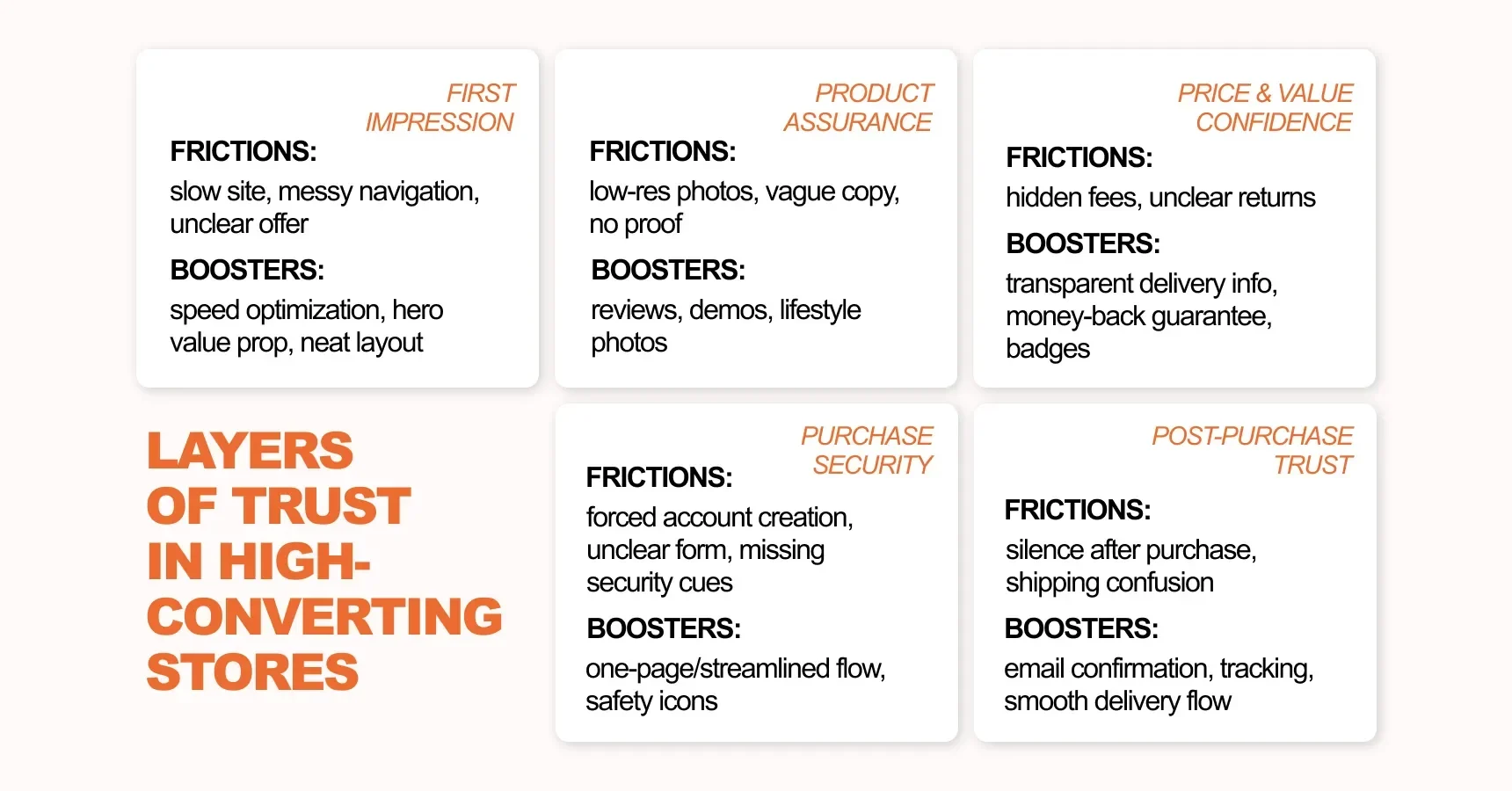
4️⃣ Trust signals & social proof
People trust people. Star ratings, verified reviews, testimonials, and secure checkout badges reassure visitors that your store is reliable. Display them prominently – especially near CTAs – so shoppers feel confident hitting “Buy Now.”
5️⃣ Calls-to-action (CTAs)
CTAs act like gentle nudges. Place them above the fold, use action-oriented language (“Add to Cart,” “Buy Now”), and keep styling consistent throughout the site. A well-placed CTA can make the difference between hesitation and purchase.
6️⃣ Cross-selling & upselling
Suggest related products or “frequently bought together” items to boost average order value without overwhelming your visitors. Done right, this feels helpful rather than pushy.
7️⃣ Pop-ups & behavioral triggers
Smart pop-ups can capture attention without annoying visitors. Exit-intent offers, timed discounts, or newsletter prompts nudge users back into the funnel at the right moment.
8️⃣ Engagement & micro-interactions
Subtle effects – like hover-to-see-details, scarcity cues (“Only 2 left!”), countdown timers, or live chat support – keep visitors engaged and moving toward purchase. These tiny touches often punch above their weight.
9️⃣ Mobile & speed optimization
Slow pages and clunky mobile layouts kill conversions. Make sure buttons are finger-friendly, layouts are clean, and pages load quickly. A small fix here can make a big difference in sales.
Put all these elements together, and your product and category pages don’t just look good – they guide visitors seamlessly, build trust, and make buying effortless. Nail these fundamentals, and your pages become powerful engines of growth for your ecommerce store.
Here’s where Sellvia’s Sellebrity theme really shines. Every product page is built for clarity and persuasion – benefit-focused copy blocks, clean, responsive design, and star ratings with visual review summaries make the decision feel easy.
Cross-selling modules appear seamlessly beneath the main product area with friendly cues like “We think you’ll love…”, creating genuine curiosity instead of distraction.

Sellebrity also adds subtle, playful engagement moments that feel native to modern shopping behavior. One standout example is its swipe-to-reveal product comparison block – two items separated by a slim line that slides as the shopper drags it, letting them “peek” at more of one product or the other.
It’s a small touch, but it sparks curiosity, keeps users interacting, and turns browsing into a tactile experience – especially on mobile, where it feels delightfully intuitive.

And because the theme is lightning-fast, your pages never test a user’s patience – whether they’re scrolling on a phone or browsing from a laptop.
Checkout & post-purchase optimization: Closing the deal
Your product pages may have convinced visitors to buy, but if the checkout process is messy, confusing, or slow, all that effort can be wasted. Optimizing checkout and post-purchase flows is where you turn intent into actual revenue.
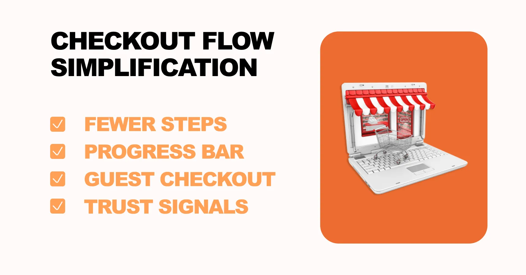
Streamline the checkout process
The fewer obstacles between “Add to Cart” and “Purchase,” the better. Here’s how to make checkout friction-free:
- Simplify forms: Only ask for essential information. Avoid forcing account creation; offer guest checkout;
- Step indicators: Show a progress bar so users know how many steps remain;
- Transparent costs: Display shipping, taxes, and fees upfront. Surprise charges kill conversions;
- Multiple payment options: Credit/debit cards, digital wallets, buy-now-pay-later, and local payment methods;
- Fast loading times: Every extra second can cause abandonment, especially on mobile.
Even small improvements – like pre-filling address fields or reducing the number of clicks – can significantly increase conversion.
Reducing cart abandonment
Cart abandonment is a major issue in ecommerce; about 70% of carts are left unfinished. Combat this with:
- Abandoned cart emails: Trigger automated emails reminding shoppers about the items they left behind. Include product images, incentives, or urgency cues;
- Exit-intent pop-ups: A gentle nudge or discount can convince hesitant buyers;
- Remarketing campaigns: Target those visitors on social media or Google Ads to bring them back.
Post-purchase optimization
The sale doesn’t end after checkout. The post-purchase experience is a hidden conversion zone:
- Order confirmation pages: Thank customers, reassure them, and highlight estimated delivery times;
- Cross-sell and upsell: Suggest complementary products or bundles without being pushy;
- Encourage repeat purchases: Offer loyalty points, subscription options, or early access to new products;
- Collect reviews and feedback: Happy customers writing reviews strengthen your product pages for future buyers.
A well-optimized checkout not only improves immediate conversion rates but also builds trust, encourages repeat purchases, and strengthens long-term customer lifetime value. By combining frictionless checkout with thoughtful post-purchase engagement, you create a smooth, reassuring shopping experience that keeps buyers coming back.
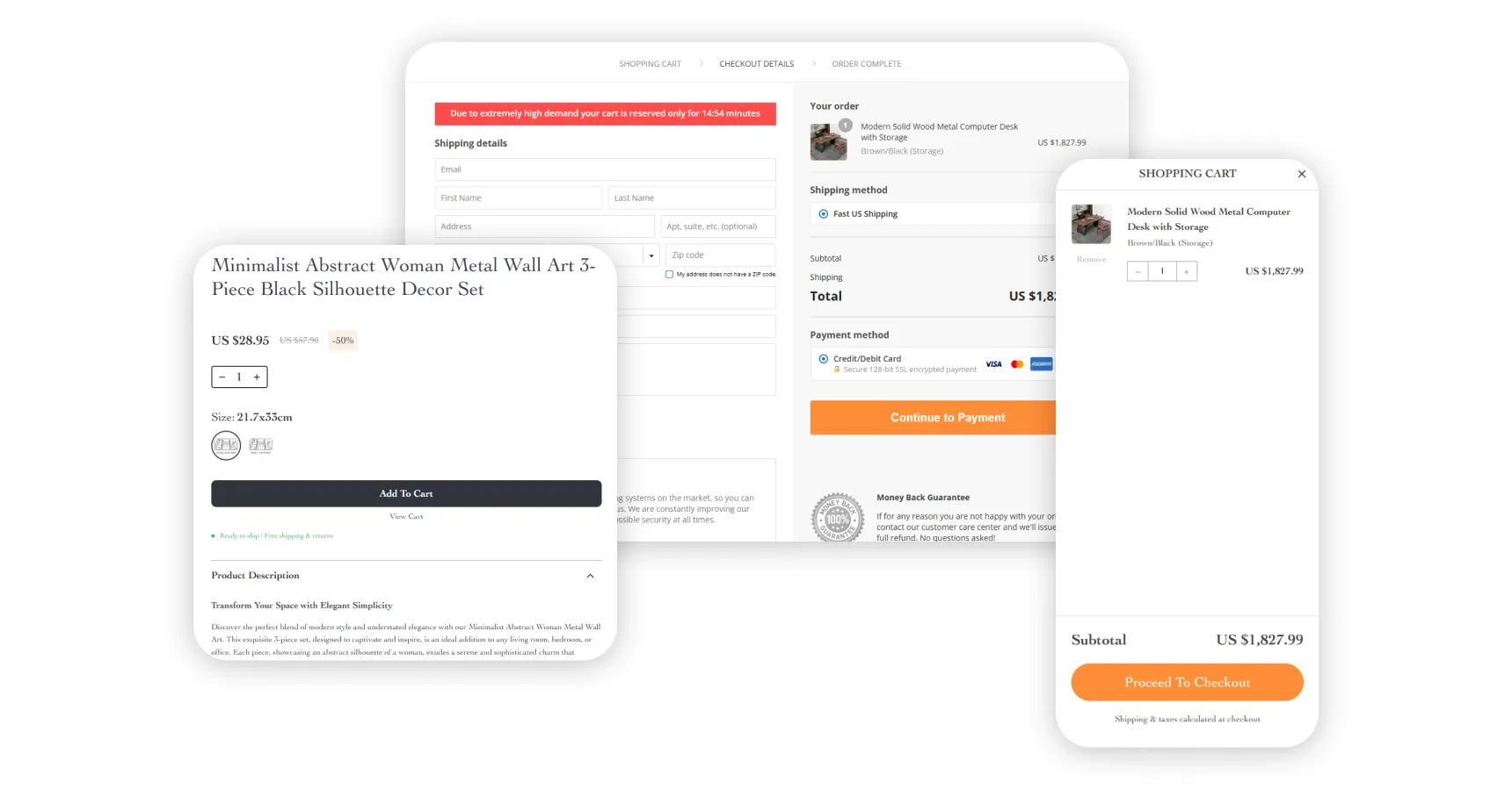
And this is where Sellvia absolutely nails the experience. Its one-click checkout strips away every unnecessary step, keeping buyers focused and confident. The form is refreshingly simple – no forced account creation, just essential details presented clearly and compactly. Costs are fully transparent from the start, so there are no surprises at the finish line.
To keep momentum high, the Sellebrity checkout includes an urgency bar. A countdown timer ticks down gently at the top – enough to encourage action, without feeling gimmicky. It’s subtle but effective – a gentle nudge that taps into scarcity without feeling pushy. Combined with lightning-fast performance and sleek design, this checkout doesn’t just process payments – it protects conversions.
Personalization, segmentation & behavioural triggers: Make your store feel one-on-one
Imagine walking into a store where the staff knows exactly what you like and shows you relevant items immediately. That’s the power of personalization in ecommerce. When done right, it can significantly boost conversion and AOV by making your visitors feel understood and guided.
Segment your audience
Not all visitors are the same. Segmenting your customers helps you tailor their experience:
- New vs returning visitors: Returning shoppers often respond better to loyalty incentives or cross-sells;
- High-value vs occasional buyers: Offer premium products or bundles to those who historically spend more;
- Device-based segments: Mobile users may prefer simpler navigation and quicker checkout;
- Behavior-based segments: Browsers who frequently view certain categories can be targeted with related suggestions.
Segmentation allows you to show the right message to the right person at the right time, which improves conversion without changing the site for everyone.
Personalize onsite experiences
Use dynamic content to make the experience feel tailored to each visitor. Show recommendations based on their browsing history or segment, highlight promotions relevant to them, and display scarcity or urgency messages at the moment they’re most likely to act. These personalized cues guide visitors naturally and build trust, boosting the chances they’ll complete a purchase.
Behavioral triggers and automation
Behavioral triggers help capture attention at the moment it matters:
- Exit-intent pop-ups: Offer a small incentive before the visitor leaves;
- Browse-abandon triggers: Remind shoppers about products they spent time viewing but didn’t add to cart;
- Cart abandonment emails: Nudge users back to finish their purchase;
- Post-purchase triggers: Suggest complementary items or collect reviews.
By combining segmentation, personalization, and behavioral triggers, you make your ecommerce experience proactive rather than passive. Visitors feel guided and supported, which naturally increases the likelihood of purchase.
With Sellvia, personalization isn’t an afterthought – it’s baked in. From segment-aware content to mobile-first navigation and contextual product suggestions, every visitor feels like the experience was crafted just for them, boosting both conversion and customer satisfaction.
In the next section, we’ll explore testing and experimentation to validate these changes and ensure every tweak actually improves your website’s conversion.
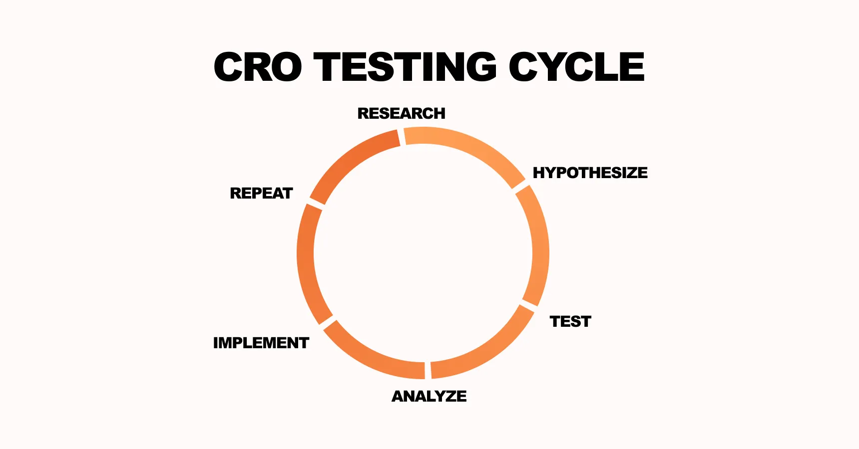
Testing, experimentation & iteration: Don’t guess, measure
Even the best ideas for product pages, checkout flows, or personalization are just guesses until you test them. A/B testing and experimentation turn assumptions into data-driven decisions, which is the backbone of any serious conversion optimization for ecommerce website strategy.
Build a structured testing process
A clear testing framework keeps your optimizations focused and measurable. Follow these steps:
- Generate hypotheses: Identify friction points and predict how a change will improve conversion. For example, “If we move the add-to-cart button above the fold, the add-to-cart rate will increase”;
- Prioritize tests: Use the PIE model – Potential, Importance, Ease – to pick high-impact experiments first;
- Set up experiments: Use A/B testing for a single variable or multivariate testing for multiple changes. Ensure proper sample size for statistical significance;
- Measure results: Track primary metrics like conversion rate, AOV, and cart abandonment, plus secondary metrics like session duration or bounce rate;
- Roll out winners: Implement changes site-wide only after a clear win;
- Iterate continuously: Optimization is an ongoing cycle. One test leads to the next idea, gradually compounding improvements.
Common testing pitfalls
Many ecommerce businesses fail to see results because they:
- Test too many variables at once, creating inconclusive results;
- Ignore traffic segmentation, assuming all visitors behave the same;
- Don’t measure secondary effects, like AOV or return rates;
- Stop after one test, instead of building a culture of continuous experimentation.
Tools for testing & insights
Analytics tools, heatmaps, session recordings, and A/B platforms (like Google Optimize, VWO, or Optimizely) make testing practical. Combine quantitative data (clicks, conversions) with qualitative insights (user recordings, surveys) to understand why changes succeed or fail.
Sellvia makes testing straightforward. Lightweight, responsive, and structured, its pre-built templates and clean code ensure accurate testing across product pages, checkout, and personalized content. You can focus on learning and iterating instead of fighting with technical limitations.
By systematically testing, you reduce risk, increase confidence in decisions, and ensure that every tweak – whether in product pages, checkout, or personalization – actually moves the needle. Iterative optimization is what separates guesswork from measurable growth.
Common pitfalls and how to avoid them
Even the best conversion optimization for ecommerce website plans can fail if you fall into common traps. Knowing these upfront saves time, money, and frustration.
1. Focusing only on traffic
Many store owners chase more visitors but ignore whether those visitors actually convert. Without addressing friction or improving funnels, extra traffic often leads to wasted ad spend.
Fix: Prioritize improving conversion before increasing traffic. A small lift in conversion can be worth more than double the traffic.
2. Ignoring mobile experience
Desktop and mobile shoppers behave differently. Neglecting mobile can result in high bounce rates and lost revenue.
Fix: Test every page on mobile, optimize load times, and simplify navigation and forms.
3. Making changes without testing
Changing layouts, buttons, or copy without measurement is guessing, not optimization. Some “improvements” can even hurt conversion.
Fix: Use A/B testing or multivariate testing to validate changes before full rollout.
4. Overloading customers
Too many pop-ups, calls to action, or distractions dilute focus and reduce conversions.
Fix: Keep pages clean, limit CTAs, and guide users toward one clear action per page.
5. Neglecting post-purchase experience
Many stores focus only on the initial sale and ignore retention. Missing this step leaves money on the table.
Fix: Use post-purchase emails, upsells, and loyalty programs to increase repeat purchases and lifetime value.
By watching for these pitfalls and applying fixes, your ecommerce store avoids common mistakes and maximizes the impact of your optimization efforts.
To avoid common pitfalls and make your store more effective, Sellvia offers practical tools out of the box. With fast, mobile-friendly pages, built-in conversion features, and SEO-optimized layouts, it helps reduce friction and improve the shopping experience.
Roadmap: Putting it all into action
Now that you understand the key levers of conversion optimization for ecommerce websites, it’s time to turn knowledge into a plan. A structured roadmap keeps your team focused, helps measure progress, and ensures improvements actually move the needle.
Phase 1 – Audit and baseline (weeks 1–2)
- Measure your current conversion funnel: overall conversion rate, cart abandonment, add-to-cart rate, and average order value (AOV);
- Segment by device, traffic source, and user type to spot friction;
- Review analytics, heatmaps, and session recordings to uncover behavioral insights.
Phase 2 – Quick wins (weeks 3–6)
- Tackle high-impact, low-effort fixes like simplifying checkout forms, improving product page images and copy, streamlining navigation;
- Implement basic personalization: recently viewed products, top-selling recommendations.
Phase 3 – Medium-term optimizations (weeks 7–12)
- Run structured A/B and multivariate tests on headlines, CTAs, and product page layouts;
- Test behavioral triggers: exit-intent pop-ups, cart abandonment emails, and post-purchase cross-sells;
- Optimize mobile experience and site speed further.
Phase 4 – Continuous iteration (ongoing)
- Document results, learnings, and successful tests;
- Prioritize next round of improvements using PIE (Potential, Importance, Ease);
- Refine segmentation and personalization strategies as customer behavior evolves;
- Scale successful experiments across other products, categories, and channels.
Assign roles and tools
- Analytics & data: track metrics, segment traffic, and report on improvements;
- UX & design: implement page and checkout optimizations;
- Marketing: run behavioral triggers, emails, and campaigns;
- Development: ensure fast load times, functional site, and test deployment.
With a clear roadmap, you’re no longer guessing – every step is deliberate, measurable, and geared toward increasing conversion, revenue, and long-term growth.
Key takeaways & next steps
You’ve walked through the essential steps to improve your store’s conversion rate: measuring your baseline, identifying friction, polishing product and category pages, simplifying checkout, personalizing the experience, and testing every change. Each of these moves boosts the likelihood that visitors will convert into buyers – but applying them consistently takes time, focus, and a solid platform.
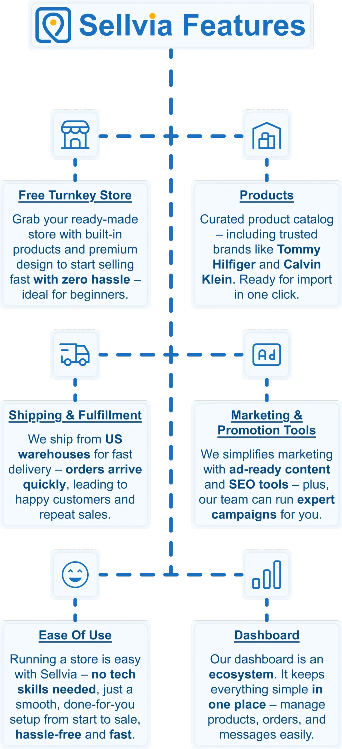
That’s where Sellvia comes in. Think of it as more than a tool – it’s a full ecosystem built to supercharge your conversion optimization for ecommerce website growth. Every element you’ve learned to optimize is already baked into a Sellvia store, from product pages to checkout flow and behavioral triggers. That means the logistics are handled so you can focus entirely on driving sales and iterating on what works.
Launch without the setup overwhelm
Getting a store live can feel daunting. Designing pages, curating products, and setting up shipping are all potential roadblocks. With Sellvia, you get a fully-designed, conversion-ready store from day one. Your homepage, product pages, checkout process, and behavioral triggers are already aligned with best practices – no guesswork, no coding, no wasted time.
Sell products that convert
Conversion optimization isn’t just about design; it’s about selling the right products effectively. Sellvia’s curated catalog features items that solve real problems and already show strong demand. High-quality images, detailed product descriptions, and clear calls-to-action give your product pages an immediate advantage – directly complementing your CRO strategies around add-to-cart rates and average order value.
One dashboard, total control
Managing multiple apps and integrations can slow you down and harm conversions. Sellvia centralizes product sourcing, order fulfillment, traffic insights, and analytics in one dashboard. That means fewer distractions and more focus on the tactics you’ve learned – A/B testing, personalization, and segmentation – without juggling multiple tools.
Fulfillment & automation that keeps the buy cycle smooth
Checkout and post-purchase experiences are crucial for maintaining trust and reducing drop-offs. Sellvia automates order processing, shipping, tracking, and inventory updates, ensuring every purchase flows seamlessly from click to delivery. This keeps your customers happy and encourages repeat purchases – exactly the kind of post-purchase optimization you’ve implemented throughout your CRO strategy.
Low risk, high return
One of the most exciting things about conversion optimization is that small improvements can generate major gains. Sellvia complements this principle with a low-upfront-cost model. No inventory purchases, storage worries, or pre-paid shipping costs are needed. You can launch, apply your CRO tactics, and scale what works – with minimal financial risk.
Support that helps you keep improving
Conversion optimization isn’t a one-time project – it’s an ongoing journey of testing, learning, and iterating. Sellvia’s support, tutorials, and ready-made marketing materials help you stay on track. You’ll be able to implement your optimization roadmap faster, smarter, and with confidence.
Your next step: Turn knowledge into action
With Sellvia, you’re not just launching a store – you’re launching a conversion-driven machine. Your strategy finds a compatible platform. Your store starts aligned for growth from day one. All the lessons you’ve learned in this guide – from baseline measurement to personalization and testing – now have a home where they can thrive.
View the Sellvia demo stores to see how a high-converting ecommerce website is built in practice. Responsive design, user-friendly navigation, clear product descriptions, high-quality images, secure checkout, and seamless shopping carts – it’s all there, ready to help you turn traffic into revenue.
Your store deserves more than traffic – it deserves real sales. Sellvia gives you lightning-fast shipping, optimized conversions, and effortless fulfillment from day one. 🚀 Join Sellvia now and start growing your ecommerce success story!
What is conversion optimization for an ecommerce website?
Why is conversion optimization important for online stores?
How do I measure my ecommerce conversion rate?
Can small stores benefit from conversion optimization?
What are the most effective strategies for increasing conversions?
![Step-By-Step SEO Guide For Your Dropshipping Store [Beginners-Friendly]](https://sellvia.com/wp-content/uploads/2024/10/Обложка-v2-min.png)

![The Easiest Way To Advertise Your Business In 2026 [Sales Are Guaranteed]](https://sellvia.com/wp-content/uploads/2025/04/Обложка-v2-min.png)